
At Walvis Technologies, we like to see trends as a way of celebrating creativity in the web design world. While the word 'trend' can be unflattering, trends signify cultural movements and understanding them enables designers to experiment and evolve their style.
In this article, we will discuss a compilation of web design trends that have captured our interest throughout 2019
Brutalism

Brutalism is a style of art first applied to the raw and blocky architecture of the 1950s and 1960s. The design style is renowned for its unapologetic and block-like aesthetic, purposefully polarizing the ornate architecture that came before in the early 20th century.
Brutalism today has become very popular in digital design as it appears to represent a similar reaction to the lightness and 'perfect' characteristics of modern web design.
Digital brutalism can be characterized by large, misplaced lettering and imagery, unique hand-drawn elements and vivid colours.
Custom cursors

Reference: https://contrarycon.com/
The return of custom cursors has seen an elaborate change in technology since the times of trail effects. Designers are keen to do something different and utilize every element of a website to make it engaging and interesting. Reactive cursors change shape, colour, size and animation in response to site elements and other cursors include secondary pointers, where elements follow the cursor around.
Serifs
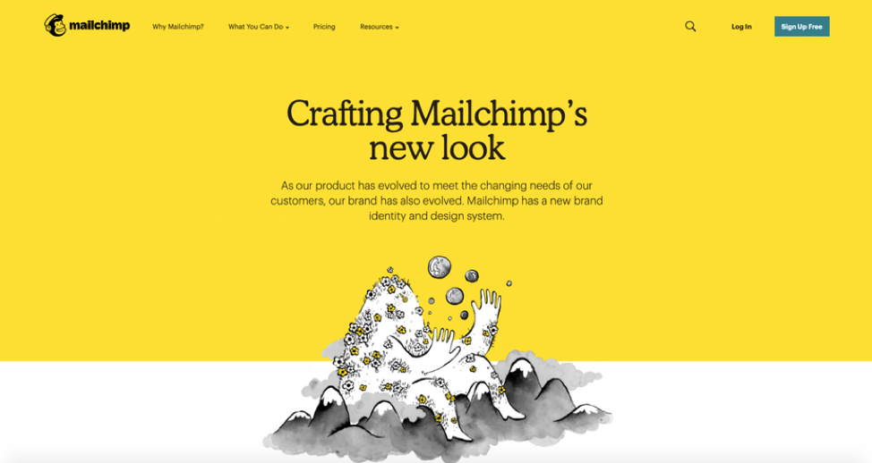
Reference: https://mailchimp.com/design/

Reference: https://medium.com/membership

Reference: https://chouwenchung.org/
Most designers abide by the rule that serif type is for print and decorative purposes whereas san serifs are for the screen. However, 2019 has seen a shakeup and many companies are now rebranding with serif. Serif's embellishments and intricacies demonstrate why designers are using the typeface to create elegant headers and sophisticated titles. The serif typeface is now commonly paired with a minimalistic design and demonstrates an element of maturity when compared to other brands characterized by sans serif.
The Continued Growth of Split Screen Design
Split-screen design continues to grow in popularity because it is effective. Requiring a user to make a choice right away encourages engagement and establishes what the company has to offer. In addition to being aesthetically pleasing on larger screens, the design is perfect for responsive websites as the sections can be stacked without negotiating quality. In 2019 we are seeing an evolution in split-screen design, moving from a basic design with two CTA's to a split-screen with multiple clickable areas.
Micro-interactions

Reference: https://femmeandfierce.nl/journal
Micro-interactions are small moments where the user and design interact and trigger feedback. When done correctly micro-interactions deliver an engaging and unique experience.
Micro-interactions can convey system status, communicate progress and establish brand identity.
In 2019 micro-interactions are here to make websites feel smarter. Features like, hover animations and humorous mini-games will make the user feel involved and create a fluid user experience.
Screen Dominating Text

Reference: https://taylerfreund.webflow.io/
Content is key to creating an effective website and in this particular design trend, the text takes centre stage. Hero images are being replaced by large and striking typography. This technique evades predictability and content becomes the design.
To keep up to date with our latest news follow us on social media – Instagram, LinkedIn, Facebook